
The Challenge
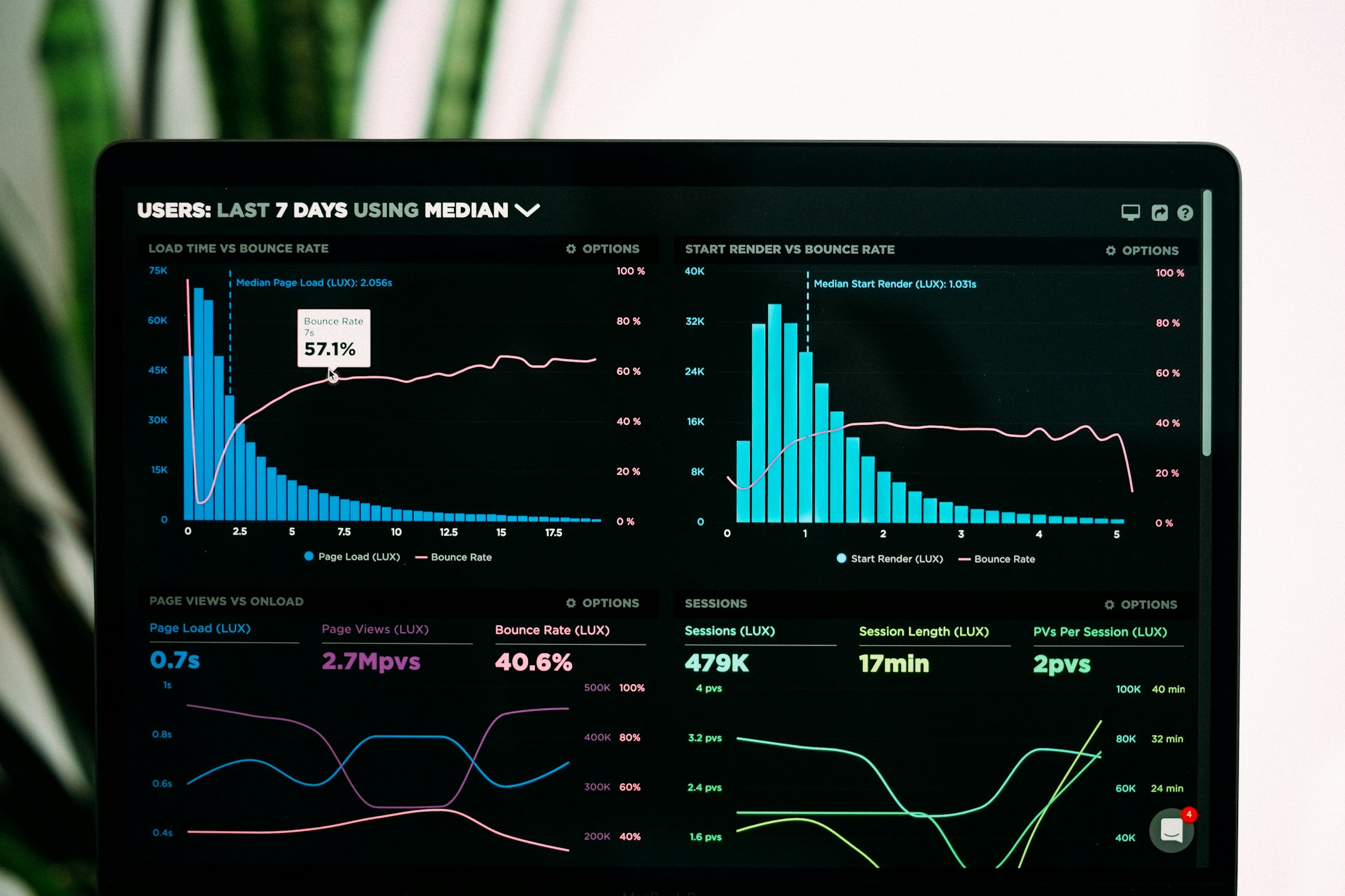
Financial analysts at [Company] were spending 20+ minutes generating a single quarterly report. The legacy dashboard was cluttered with over 50 data points on load, causing severe cognitive overload.
The Goal: Streamline the workflow to reduce time-to-value without removing the granular data power users relied on.
Discovery & Research
I conducted user interviews with 12 senior analysts and utilized Hotjar heatmaps to understand current behavior.

The Solution: Progressive Disclosure
We moved from a "Show Everything" model to a "Widget-Based" model. Users can now pin their top 5 critical metrics to the home view, with secondary data accessible via drill-down interactions.
I also implemented a strict Design System update, moving to a 4pt grid and increasing contrast ratios to meet WCAG AA standards.
The Impact
Retrospective
What went well: Collaborating with engineering early allowed us to use existing API endpoints, saving 2 weeks of dev time.
Growth Area: In hindsight, I would have prototyped the "Widget Customization" flow earlier. User testing revealed some friction in the setup process that we had to patch post-launch.